
The Story Behind Bali Sunaren Read more or download here
We are a from beautiful island
Talk
 about this topic,
 what springs
 to mind when
 you hear the
 word
word
 “Bali”?, Gorgeous Beaches?, Cultural Treasure Troves?, Blissful Harmony?
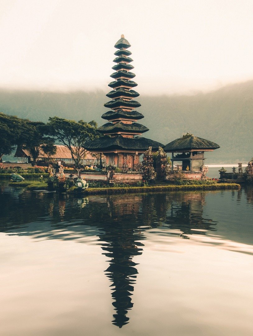
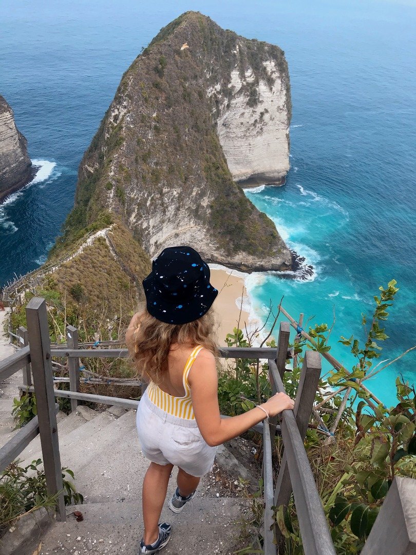
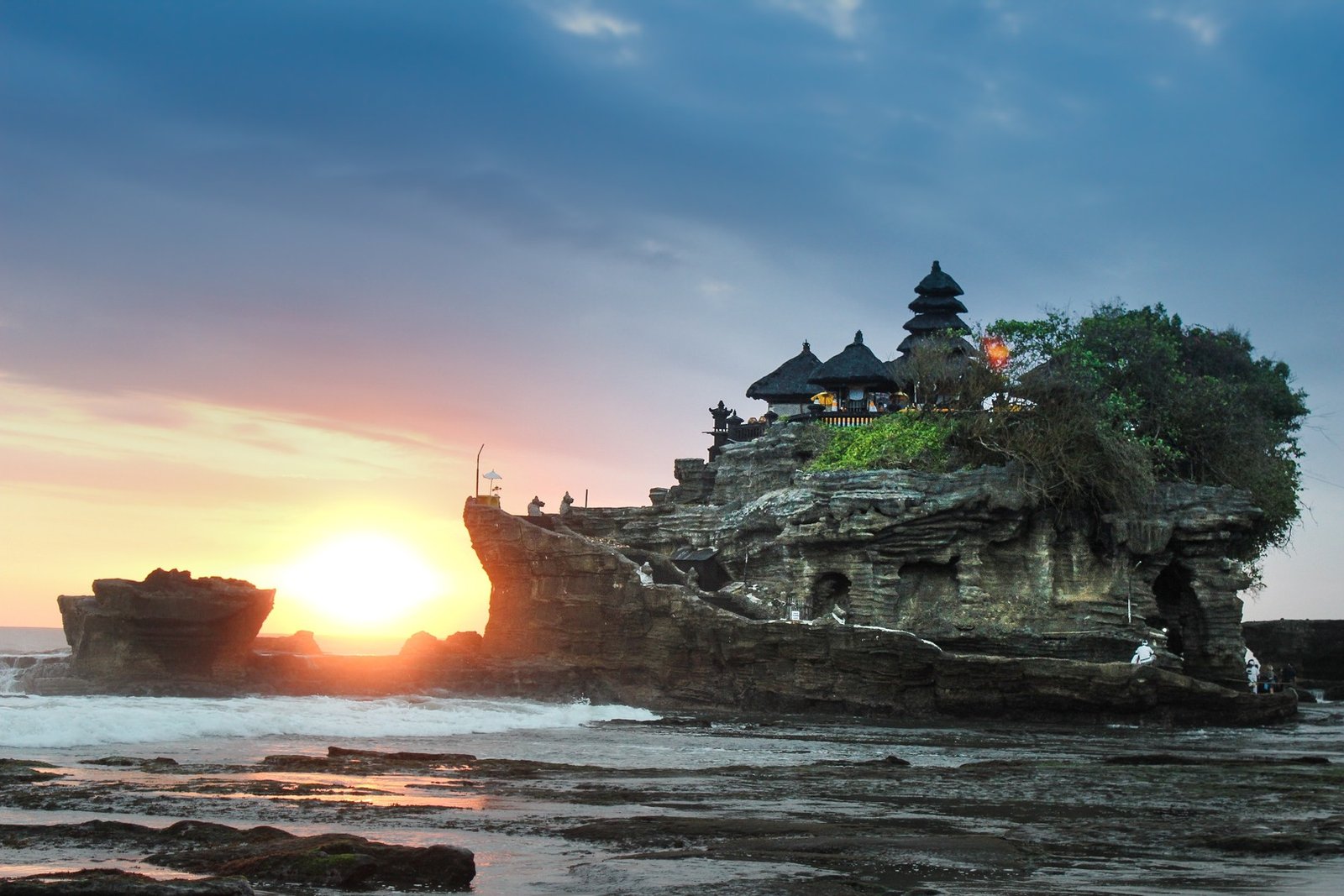
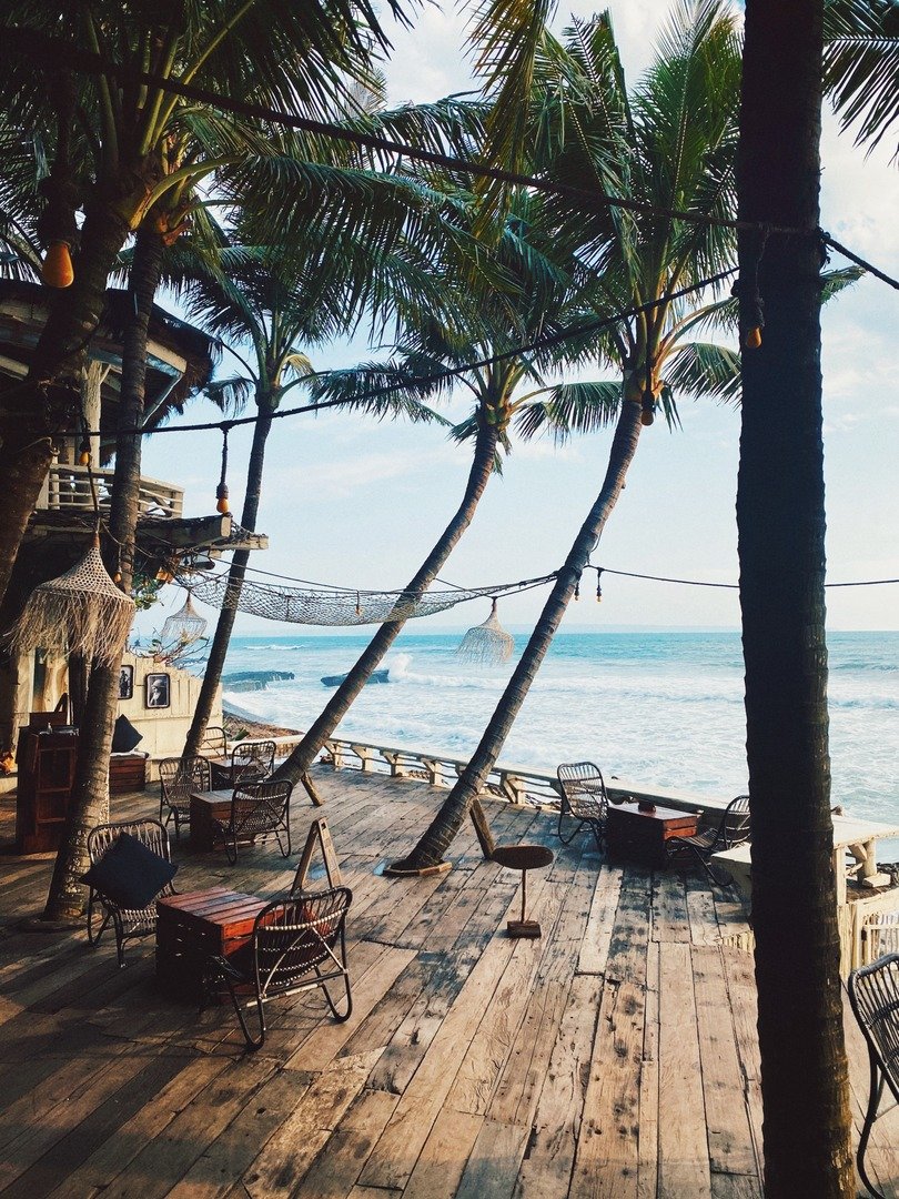
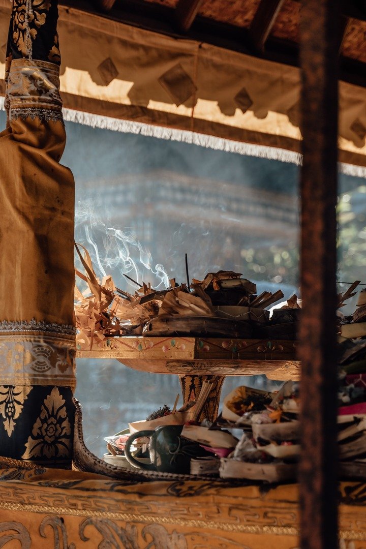
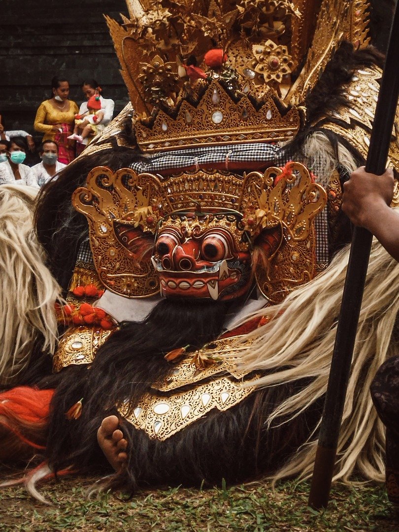
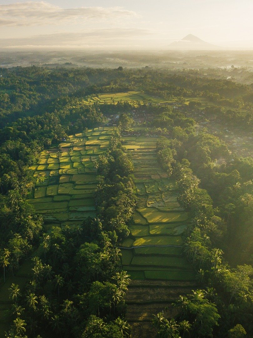
For many folks, Bali is all about those three things. But for us, it’s more like our adventure-filled playground. A home that we’re super eager to explore, especially as a type foundry our interest in typography runs deep and naturally. Before, we found great joy in crafting typefaces for Latin languages while delving into letterforms, and technical functions eventually. It turns out that we realize typefaces are not just collections of readable letters; they can have a significant impact.
OUR CULTURAL GEM ✹ IS THE ☛ BALINESE
TRADITI◐NAL
SCRIPT «SYSTEM»
Harmonization
In the context of type design, harmonization can refer to the process of choosing elements that work well together to create a cohesive and visually appealing design. This could include concepts that complement each other, colors that are harmonious, and forms that create a sense of balance. The aim of harmonization is to reduce conflicts, discrepancies, and inefficiencies that can arise from differences among these elements. Bali Sunaren’s dedication is harmonizing two different scripts, this is a challenge because they often have different visual characteristics. Harmonization is important for a number of reasons. First, it can make text more readable for people who are familiar with multiple scripts. Second, it can help to avoid cultural appropriation, as it shows respect for the different scripts that are being used.
”Harmonization is the key to creating a cohesive and unified design.” Jessica Hische, type designer (2014)
As mentioned earlier, upon immersing ourselves further into the realm of typography and observing how typeface functions on a technical level, one issue that has caught our attention is the prevalence of designs that do not employ appropriate typeface choices aligned with their intended concepts. There are also instances where combinations of typefaces have yet to find their harmony within the design.
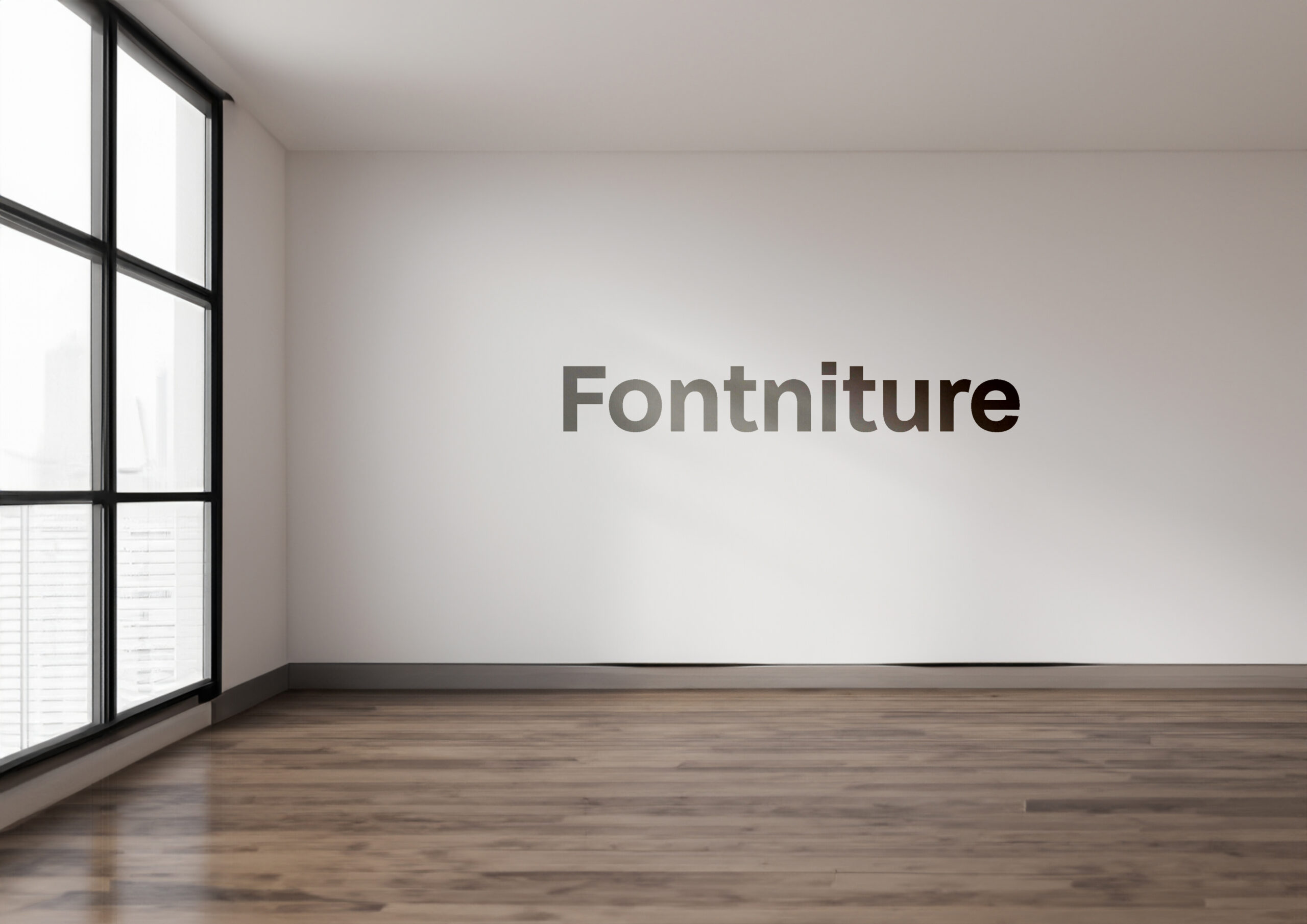
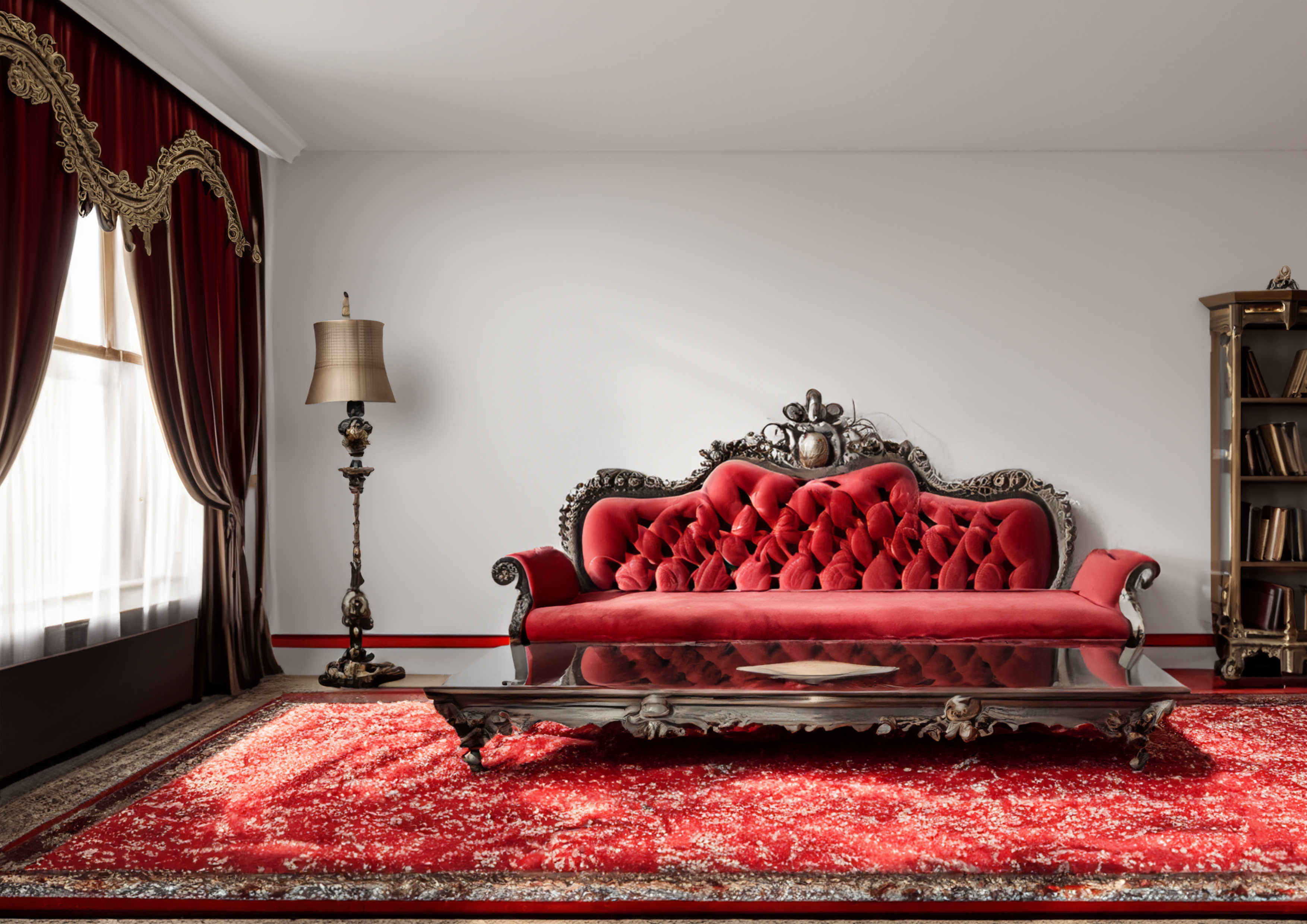
This is the AnalogyThink of harmonizing design as choosing the right typeface, much like selecting furniture for a room. Furniture acts as interior design’s partner in crime. It’s the key to shaping a room according to its intended ambiance. Using furniture that doesn’t mesh with the room’s concept can drastically alter the mood and appearance, throwing off the intended harmony.
On the other hand, typeface constitutes a pivotal element within graphic design, wielding substantial influence in crafting a design. If the selection or pairing of typeface doesn’t align with the initially conceived concept, the design lacks internal harmony.
Type foundry much like a furniture designer holds a similar philosophical role.
The interior designer is responsible for crafting furniture that resonates with the desired room ambiance—balancing functionality and aesthetic appeal. We, as a type foundry, carry the weight of ensuring that the typefaces we create are not only functional for users’ needs but also exhibit an aesthetic charm.

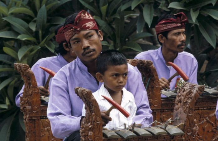
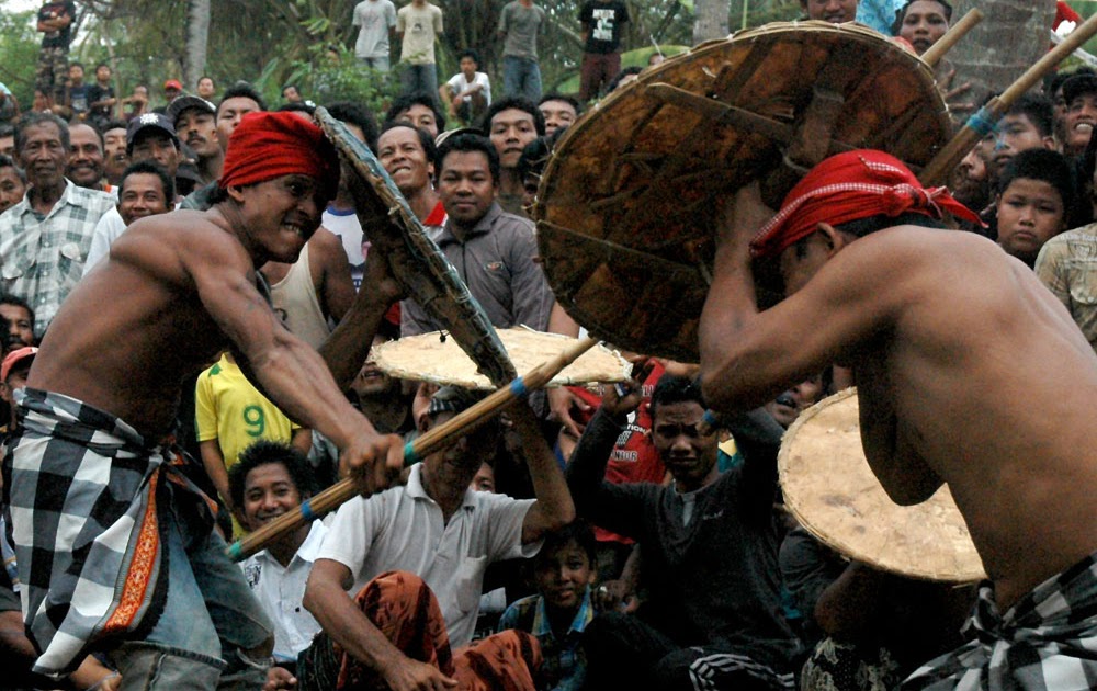
Concerns about harmony and honor to our rich culture.
Upon identifying the issues and drawing parallels between furniture and typeface, we made a resolute decision: to create a typeface that would address our concerns about harmony. We embarked on crafting a sans-serif typeface that seamlessly blends both Latin and Balinese scripts. The choice of the Balinese script is a gesture of honor to our rich culture. The seed of this idea was planted back in December 2022, during our studio’s rebranding discussions. Our inspiration was drawn from type designer Aditya Bayu’s masterpiece ‘Vimala,’ released in 2018, and the timeless typeface ‘Bali Simbar’ by I Made Suatjana, dating back to 1995. Engaging in lively discussions over cups of coffee, we underwent a brainstorming process to define the contours of the typeface we envisioned. Eventually, we chose to make a sans-serif typeface.
Below are some of the processes we have carried out.
Development
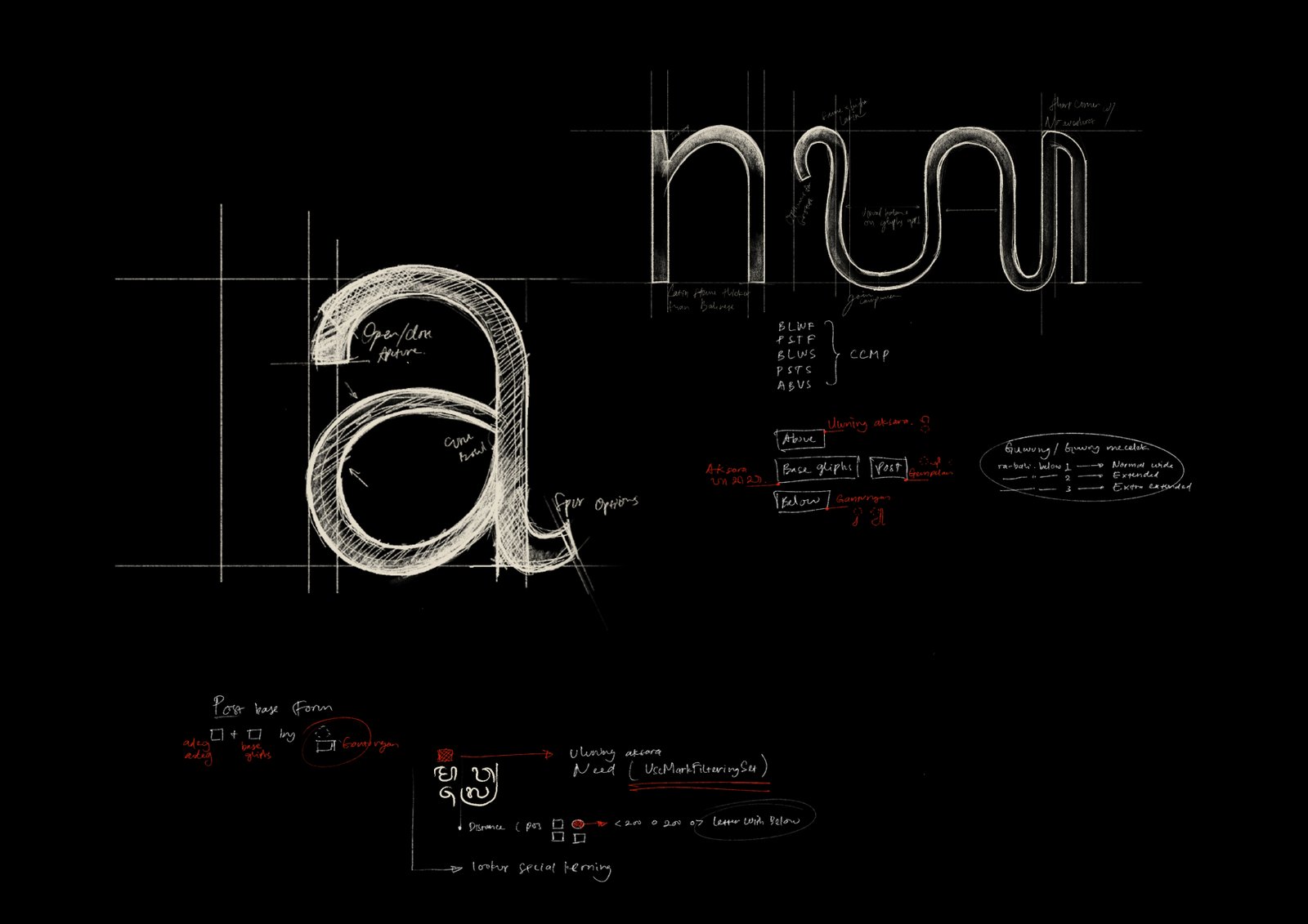
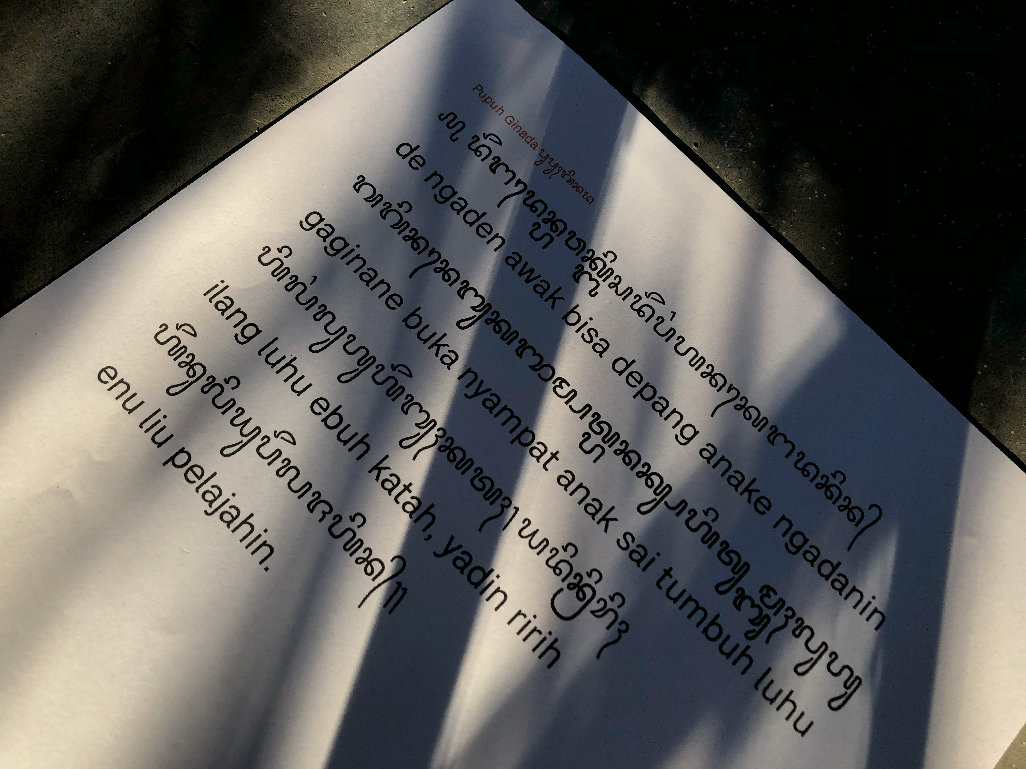
We started by exploring the Latin script, and the first letter we looked at was “a”. Not because it’s the first letter in the alphabet, of course. But because the letter “a” is just so much fun to explore. It can be expanded into a number of other letters, and it has a grotesque accent that we wanted to capture in our letterform. Working with the flow, this gave the letter a Neo grotesque accent, we also added a tail to the letter “a” and applied it to both the letter “a” and the letter “l”. Also, we applied the same tilt spur and aperture to the lowercase letters “c,e,f,j,s,t,y” to make the letterform consistent. One of the biggest challenges was kerning in Balinese script. The Balinese script has a lot of diacritics, and it was tricky to get them to line up correctly. We also had to make sure that the characters didn’t bump into each other. Problems are solved thanks to the Opentype feature. In the end, we were able to finish at all. We think it’s a great way to preserve the Balinese language and culture.
How to Use Bali Sunaren
on Your Device?

It is important to understand that using a non-Latin typeface on your device differs from employing a Latin typeface that utilizes a general keyboard. Non-Latin typefaces require a specialized keyboard known as the Keyman keyboard. To provide some context on the Keyman keyboard, it is a program designed to configure one language into another. In this context, it facilitates the reconfiguration of languages based on the Latin script into those utilizing non-Latin scripts, such as the Balinese language. Furthermore, Keyman can configure more than 2000 languages. You can directly download the Keyman keyboard from its official website [here] Before commencing its use, make sure that the configuration selected is Balinese Unicode script. For a comprehensive tutorial on utilizing the Keyman keyboard, refer to [this resource]

Pairing Font Session
By pairing the different scrip we wanted to show that our typeface is versatile enough to be used for both text and display purposes. We had a lot of fun experimenting with font pairing. It was great to be able to explore the possibilities of our typeface and see how it could be used in different ways. We’re so pleased to be able to complete this project. It wasn’t easy, but we overcame the challenges and finally finished our first Balinese typeface.